When putting together your resume, the font used is just as important as the information the resume contains. It may seem minor, but your document could get overlooked if not done right.
According to Indeed, “Employers look at resumes for six to seven seconds on average.” So, first impressions matter. Your writing should show professionalism and make it easy for your hiring manager to read.
There are over 400,000 varieties of fonts, so how do you know which one to use for your resume?
Research shows that the most legible fonts are in the family of Serif and Sans Serif. Serifs are preferred for their readability, while sans-serifs are chosen for appearance. However, the Sans Serif family is currently the best option for giving your resume a contemporary look and feel.
Here are the seven best fonts from the Sans Serif family to make your resume stand out in the marketplace.
- Calibri
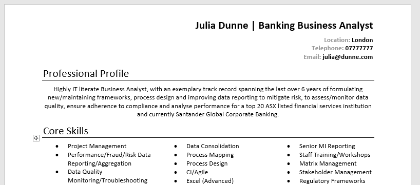
Source: StandOut CV
It’s very familiar, right? Calibri is a very soft and modern sans serif that appeals to the eye. Since its invention, it has replaced the default Times New Roman on all Microsoft platforms. It is often preferred due to its simplicity.
- Open Sans
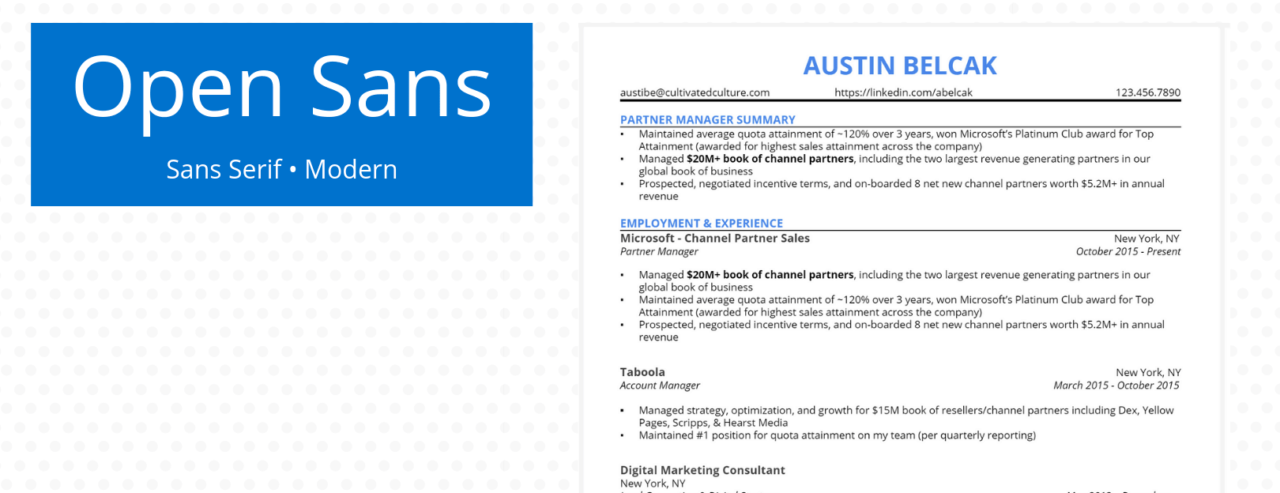
Source: Cultivated Culture
Open Sans is in the sans serif family and is considered a humanist Sans serif typeface. It is a great choice for an excellent and legible CV.
- Avenir
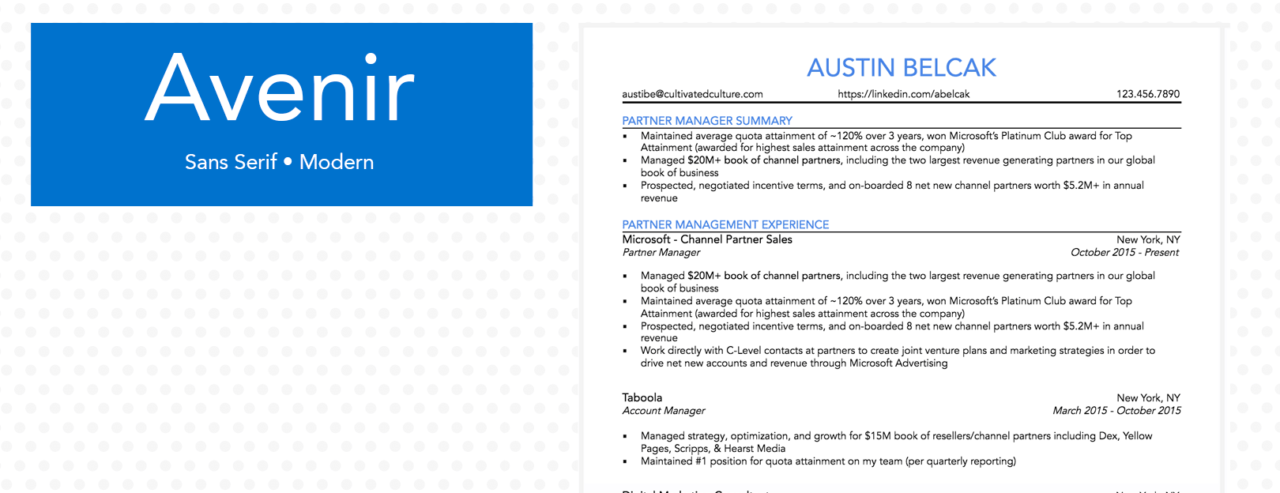
Source: Cultivated Culture
Avenir is a geometric sans-serif typeface. Its beauty is in its coordination. A well-formatted resume pleases the eye because the information is easy to scan.
- Lato (Modern)
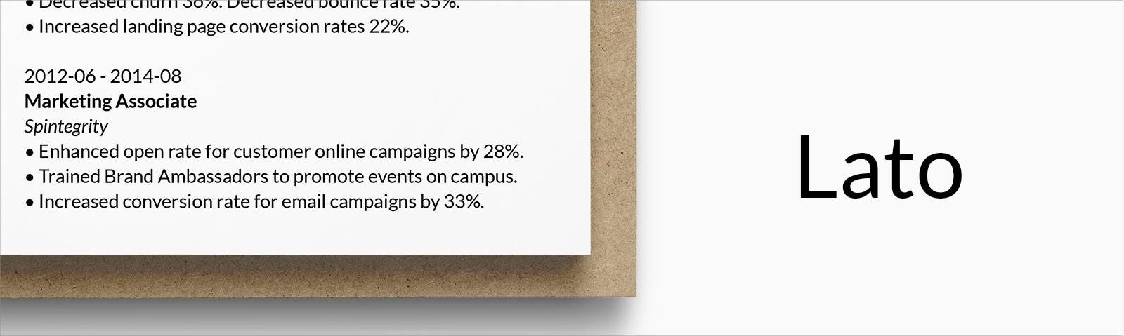
Source: Zety
Lato gives a feeling of stability and seriousness in writing. This sans serif typeface makes your work look sleek and breathes subtle confidence in your write-up. Lato is great for professional writing.
- Roboto (Modern)
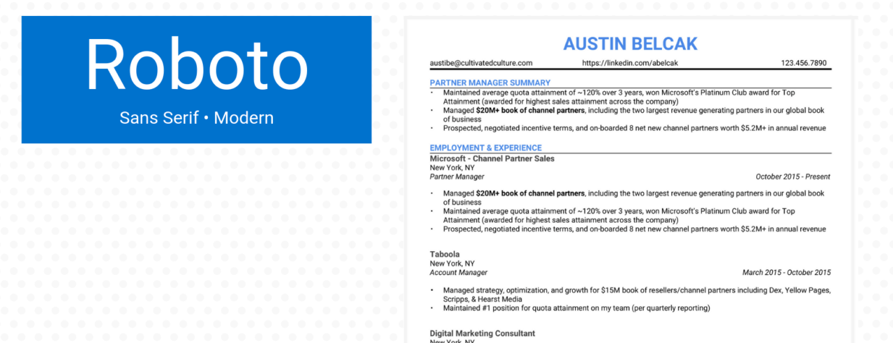
Source: Cultivated Culture
The Roboto font allows letters to settle in their most natural form due to its gracious features and open curves. Roboto gives your writing a more natural rhythm.
- Avant Garde
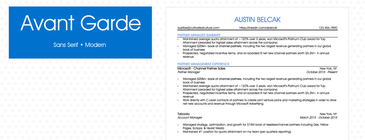
Source: Cultivated Culture
Avant Garde Font is a geometric sans-serif typeface. This font makes your resume stand out, just as recruiters would like. It works well on-screen reading because of its shape and size.
- Garamond
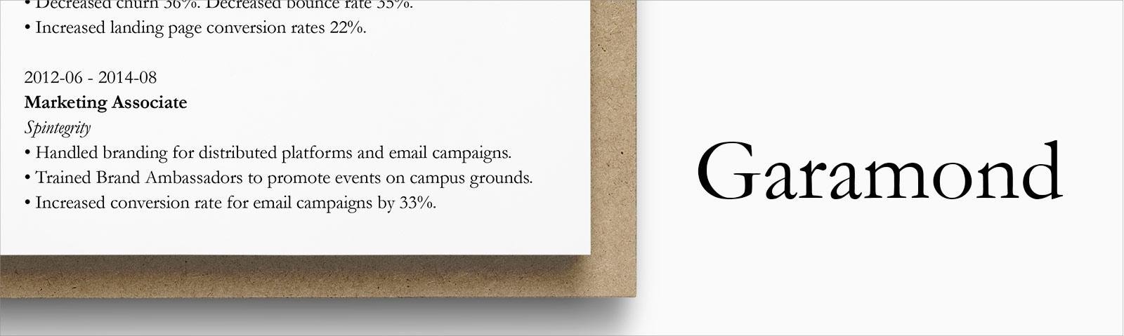
Source: Zety
Do you want a perfect blend of the classic serif and the modern sans-serif? Garamond is the answer. Its simple structure resonates with a visually appealing style, and it can also take in more words in a neatly formatted form.
In conclusion, though the crucial part of your resume is its content, how it is shown reveals your intentionality and professionalism. If you have difficulty compiling your resume, you can get a CV Review from our professional editors.